
The Costume Is Not the Culture

By Kachi Obata '28 | The Babcock Torch
Scroll through the Instagram pages of ten student-run brands on any Nigerian campus and try, genuinely try to tell them apart. One sells thrifted vintage. One sells jollof rice and grilled chicken out of a hostel kitchen or an off campus lodge. One is a creative studio offering logo design and social media management. They sell completely different things to completely different people for completely different reasons. And yet, somehow, they feel like cousins. The same soft wordmark. The same geometric sans-serif. The same beige-cream-black-blue-green palette that communicates, above all else, that the person behind the brand owns a mood board and knows how to use it. The same clean Instagram grid. The same vaguely aspirational caption language with words like "intentional," "curated," "premium" deployed not to describe anything specific but to signal a general orientation toward taste.
This is blanding. And it’s everywhere.
The term belongs to Thierry Brunfaut, a branding executive and founding partner of base design who diagnosed the condition in the tech industry several years ago. His observation was simple and brutal: a new generation of companies, rather than developing genuine identities, had collectively decided to dress like the companies they admired. The formula was paint-by-numbers: a random made up word as the name, sans-serif typeface, clean layout, direct tone, cheerful illustrations, and don't forget the purple and turquoise and blue. The result was an industry of clones, each one telegraphing youth, friendliness, and tech-forwardness without any of them saying anything in particular about themselves. Brunfaut called it blanding: branding designed not to stand out, but to blend in.
What he was describing in Silicon Valley, I am watching happen in Lagos, Ogun, Abuja etc. On campuses. In the DMs of every creative entrepreneur who has ever sent me a pitch deck. The only difference is that the formula has now been updated for a different aspiration. Where tech blanding says "we are trustworthy software," the Lagos creative class version says something slightly different. It says: we are tasteful. We are contemporary. We belong to a certain educated, urban, culturally aware world. And so the signals change slightly — it’s no longer purple and turquoise; it’s black and white, a random supposedly inspirational sentence slapped across the front of a plain tee in a gothic or ultra-clean sans-serif, a bold dark graphic from Pinterest slapped across the back, or in a particularly futile attempt at distinction — a stylized wordmark on a lanyard, because apparently that’s what passes for a logo now. The palette narrows. The language thins. Ten brands end up auditioning for the same mood board, and none of them get the part because the part doesn’t bloody exist.
Sorry if that sounded a bit harsh, I got a little worked up there.

Spotify, Netflix, Uber — the originals. Text book definition of earned simplicity
The tech giants didn't help. Spotify, Netflix, Uber — these companies shaped the modern stripped back platform aesthetic so thoroughly that their visual logic became a kind of cultural shorthand. The problem was never these brands themselves. The problem is what happened after: a generation of newer brands copied the surface without possessing the depth that made the surface mean anything. And it isn't only startups. Even established names have made the same mistake.
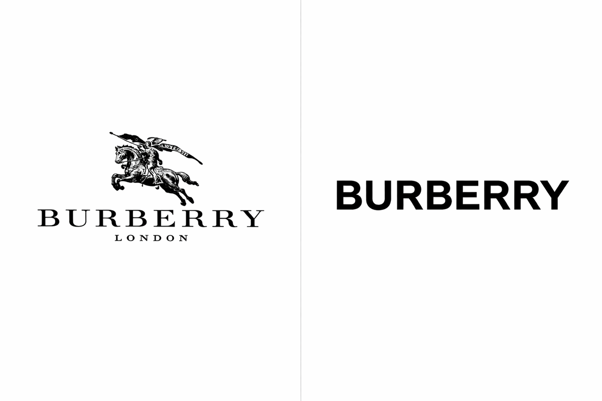
Burberry — before and after. Heritage traded for portability.
Burberry, under Peter Saville's controversial redesign, traded a wordmark loaded with heritage, style and class for a neutral typeface that could read cleanly on Instagram.
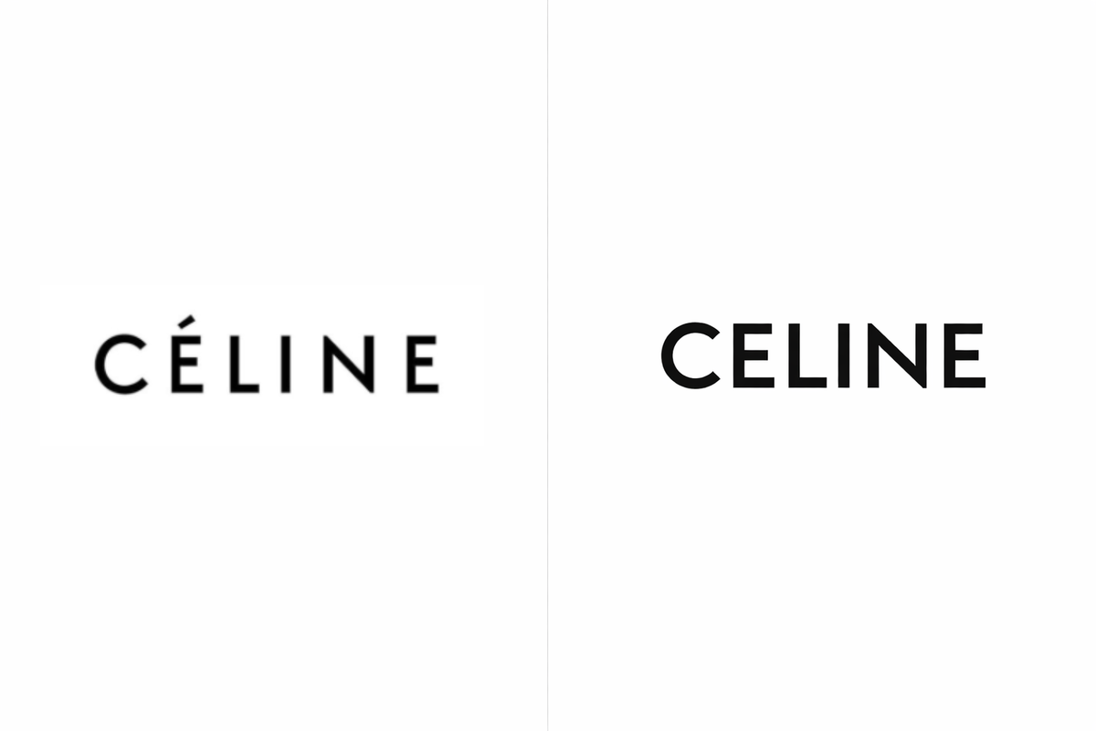
Céline — before and after. The accent was the last thing to go (literally).
Celine killed its accent and adjusted its spacing to achieve a "simplified and more balanced proportion." Both brands sacrificed the very thing that made them themselves — not for a better identity, but for a more portable one.
This, I think, is where the real diagnosis lives. Brunfaut's argument is essentially that brands are copying a visual language and losing differentiation in the process. And that’s true, but it’s not the whole truth. The deeper problem is this: most modern brands are copying the handwriting of a culture without ever learning the language it’s written in.
Apple doesn't simply have an aesthetic. It has a lived internal logic — a set of decisions about what to reject, what to prioritise, what it will never do — and the ‘aesthetic’ you see is the outward expression of that incredibly intentional logic. The same is true of Gucci, of Aesop, of Zikoko. Consider Aesop: it didn’t set out to make skincare that looked a certain way. It built a cultural posture of intellectual taste, ritual, literary restraint, what you might call designed adulthood. The amber bottles and apothecary themed interiors and quiet, cultivated language were simply what that posture looked like when it became physical. The result was so distinctive and so coherent that it spawned an entire category of imitation. Now, amber glass bottles with droppers appear with every vitamin C serum, every perfume oil and essential oil, every aromatherapy concoction, some “luxury” body care and even hair care products from here to wherever you happen to be reading this. The form survived, sure, but the posture didn’t travel with it.
That is blanding in its most precise form. It’s not aesthetics copying aesthetic, it’s signaling without any source at all — and my days it's so boring. Branding, done properly, is the act of expressing an internal truth outward. Blanding is the act of importing external signals inward to simulate an internal truth that was never there to begin with. Brands give people a world to belong to, but Blands give people a costume.
You see this most clearly when you look at what happens downstream of a genuinely original brand. Ashluxe is not simply a clothing label. It sells something more specific: celebrity adjacency, aspirational Lagos cool, the particular feeling of being adjacent to a certain stratum of contemporary African cultural life. That’s a real thing! It was very carefully and intentionally built, not borrowed. The blands following in its wake — the smaller labels with the oversized silhouettes and the minimalist luxury graphics and the expensive looking ambiguity are not building that, they’re just wearing it. They recognised what Ashluxe's world looked like and reproduced its surface features, and the result is a Lagos luxury template rather than a cultural statement. Zikoko gave young Nigerians a specific way to narrate themselves: sardonic, self-aware and fluent in the particular comedy of existing in this country. The Republic built something intellectual and editorial, rooted in a distinct African and Nigerian sensibility, and it feels rooted precisely because it is. These brands aren’t imitating a vibe, they actually own their own, and that distinction is everything.
A brand creates a culture. A bland copies the signals people use to recognise that culture. And blanding begins precisely the moment a brand tries to look like it belongs to a culture it has not built or participated in.
Does your brand have big ears? This is how people will remember you, whether you like it or not. So you might as well own it. Call your company Earful. Make an Aye-Aye (or even friggin Dumbo) your mascot. Donate a percentage of profits to preserving their habitat in Madagascar. Commission something weird but useful and entirely yours like a key chain with big ‘ol ears and give it to your clients. Live the truth that unusual builds memory. Then translate that into visuals that feel like you, not somebody else. Just stay away from the black and white palette and the gothic typeface and the bold dark graphic on the plain tee, okay? And for the love of everything, put the lanyards down.
The process of finding that real identity is cathartic, and as Brunfaut puts it, a little like therapy. It's uncomfortable to sit with the question of what your brand actually is, as opposed to what you want it to signal. But the answer to that question is the only thing worth building around. Everything else is a costume. And costumes, eventually, come off.
Kachi Obata ‘28, Head of Sponsorships & Partnerships, lives in Welch Hall
What do you think?
Share your reaction to this opinion
Comments
Leave a comment
Share your thoughts on this opinion. Comments are anonymous but must be approved by our team before they appear.